Overview

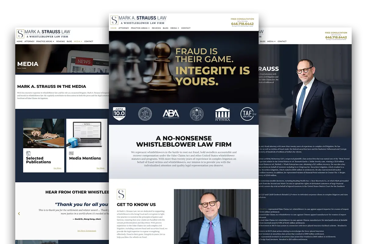
Mark A. Strauss is a prominent whistleblower attorney based in New York, renowned for successfully recovering hundreds of millions of dollars for clients in the US. While his original website contained good information, it needed a refresh to better reflect his experience and authority. Our goal was to modernize the site, ensuring it conveyed a sense of professionalism and capability while showcasing his full potential to assist clients in their legal matters.

With Mark’s well-established style and brand in mind, we engaged in detailed discussions to understand his goals and expectations. We implemented a comprehensive redesign that aligns with SEO best practices and trends. The result is a revitalized website that not only enhances user experience but also presents Mark’s expertise in a more compelling and contemporary manner.

Mark Strauss Law
Mark Strauss Law

Our Approach

We were excited to create a new user experience for this interesting legal practice. We collaborated with the client and created a new color palette, updated the design around chess pieces to denote legal strategy, and utilized UX/UI best practices to refresh the site's styling. We enhanced both the user experience and the site’s performance. Leveraging the latest in SEO and content development techniques, we successfully met the client's expectations, ensuring a seamless experience for both the client and their users
It was exciting to bring a once older site into modern practices, allowing it to have a more sophisticated look and feel, and inspire confidence for those seeking protection from an experienced attorney.
Paul B.
Design Director

Mobile device showing website
Image

Services Provided

UI/UX Design Previous design and user experience was, lack of better word, clunky. An approach to simplify layout and keep design familiar was the driving thought process for designing and implementing the new site.
Graphic Design The branding style and feel was already well established all we did was embellish more upon that bringing it further into the future and allowing new slightly updated embellishments on logo colors and graphical assets to finally come to play, allowing the site to look more modern.
WordPress Development Leveraging Elementor we developed the new site using best practices in implementation, performance and responsiveness, allowing for a clean, fluid and attractive experience while being simple and effective in the build, allowing the new site to feel familiar yet fresh and gratifying.